Easy Ways To Pick Great Colour Schemes For Your Infographics
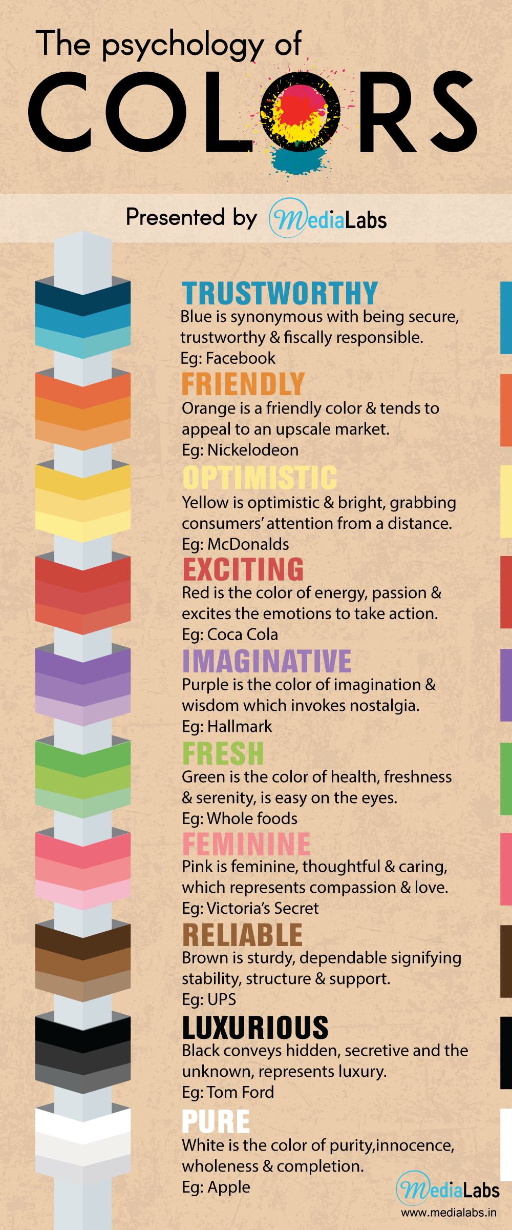
Nothing works better than a splash of colours to brighten our day. It only takes a little bit of grey to engulf us into sadness. Colours are interlinked to our memories. Every colour evokes some kind of emotion in us. Suppose if I ask, what does the colours red, white and blue mean to you, what would be your answer?
It reminds me of the American flag, for some it may be Pepsi, and for some others it might be Domino’s Pizza. Every colour in combination with other colours, when interacted with another, changes our perception about it. The effect of this interaction is called colour contrast.
The relationship of values, tones, shades and tints of respective hues can cause noticeable differences in our perception of colour. This makes colour contrast a very important element when it comes to branding or while doing an infographic.
Colours can create emotions, change thoughts, catch attention and cause actions. It can irritate you and it can calm you down. Colours are highly relative to our culture and its significance is based on the occasion.
 Right Colour Scheme
Choosing the right colour scheme for your infographic can enhance the effectiveness of the message that, you are trying to convey.
Here are some of the basic things to keep in mind, before choosing the right colour scheme for your Infographic.
- Choose a main colour and keep the maximum number of colours to four. In case you need more colours use shades and tints of the same colour.
- Once you have a main colour use complementary colours with warm and subtle shades.
- Use white spaces for the eyes to rest.
Choosing a colour is the trickiest part of all. You can search for inspirations everywhere, but let us stick to some tried and tested methods first.
Follow Company Branding
While creating an infographics for a company, one of the best ways to choose a colour is to follow the company branding. Use the colour, from the company logo as main colour and use matching complementary colours.
Content Based Colours
Colours can be chosen based on the content. Suppose, you want to create an infographic on an apple fruit drink, you can use shades of red, white and green which represent the fruit as well as its leaves. The use of the colours will directly impact the message you are trying to tell.
Nature Inspired Colour Schemes
Nature inspires us with the colours. Every season inspires us with different colours and every festival has its own colours. This kind of colour schemes can be used to convey a seasonal theme or seasonal marketing.
Selecting Complementary Colours
You can choose complementary colours using the help of a colour wheel. There are different colour schemes you can begin with.
You can either use a monochromatic tone, which uses a single colour from a colour wheel with different tints and shades of the same colour used as complementary colours or you can use a complementary colour scheme, which uses colours which are opposite to each other in the colour wheel.
Monochromatic tone provides you with a clean and polished look and it is not attention grabbing. Complementary colour schemes are good for charts and graphs, well suited when you have to contrast between things.
Analogous colour scheme uses consecutive colours in the colour wheel like yellow/yellow-orange/yellow or blue/cyan/green. Of the colours you choose, one will be the main colour and the other colours will be used sparingly. They are not used to create themes with high contrasting colours and are typically used to create a softer, less contrasting design.
Triadic colour schemes choose three equally placed colours around the colour wheels. One colour is used dominantly and the other is used sparingly or with a softer tint. These are good for graphs and pie diagrams, as it provides you contrast for your comparisons. If you use the same in an infographic, use one colour as background and the other colour as dominant and the third colour can be used as an accent.
A split complement colour scheme combines hues to the left or right of its complement on the colour wheel.
When it comes to choosing colours, sky is the limit. You can try and test methods and come up with your own colour scheme. This can happen only when you think out of the box and explore yourselves. Always remember start with one colour and build on it. Save your colour schemes in a colour palette. And as always, remember only practice makes perfect. Be creative and ready to commit mistakes, so that, you learn more and perfect your skills.
Hey, thanks for the info. Now what?
If you need any help with content creation, infographics and explainer videos please to ensure that you never miss an article.
Do you need to create infographics and explainer videos? Mail us at info@medialabs.in. Need to know more about our work? It’s easy! Simply visit our page at www.medialabs.in and check it out yourself. Follow us on Twitter, LinkedIn, Google+ and Facebook to get more updates.
Have questions or comments? Please use the comment form down below. We read and reply to every comment.
If you really enjoyed this post, please help us to spread the word by clicking one of the social media sharing buttons.
Thanks so much!