Some Important Pointers To Remember In Typography
Typography is the buzzword among graphic designers. And why not? Good typography is a sign of a successful web design. It’s because web design depends on text to a large extent that it is so vital in using the right type.
Typography has the potential to make even a mundane design look awesome. In our previous blog, we discussed why typography is important. In this blog, we have gone on to explore what matters the most in typography. Simply put, we have analyzed some factors that play a pivotal role in typography in creating the most amazing type.
Creating Visual Hierarchy
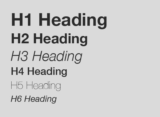
For starters – what is visual hierarchy? It is the method in which content is organized to communicate a message with the most effectiveness. The order in which the human eye perceives what it sees is influenced by visual hierarchy. We highlight certain text that we want the viewers to catch sight of first, since that maybe the most important message. So, how is that done? Well, take a look at the following typography.
We automatically chance upon the words that are in bold first and then move on to the other text, isn’t it? It tells you where to look and what to look out for.
Color Combination
Color in fact plays a crucial role in typography. The right color combination and typography takes the content to another level. But how does one define a proper color combination? Colors add dimension to the order of content, so playing around with colors can be a little tricky and should be used cleverly. Avoid very loud color combinations. The text needs to stand out but not blind the reader. Overdone text will only look garish and gaudy. So, to get the desired effects and results, you can try using UI flat colors. These are soothing to the eyes and look great.
Line Spacing
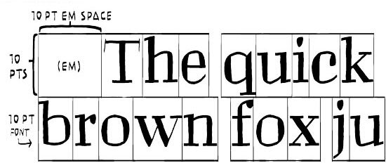
Line spacing is another important aspect that matters. It’s easier to read if the text has significant space in between and doesn’t double up on each other. One simple rule that stands out is that the line spacing should be around 0.3em – 0.5em larger than the font size. However, there may be exceptions depending on your design. You can also play around with the spacing to see what suits you the best.
Control Measure
Measure signifies width of the text. Measure defines whether the text is too wide or too narrow. Wider text may look better in specific designs while narrower text might work wonders in other designs. Measure works great together with line spacing to create text that is easy to read. If you choose a wide measure and lower the spacing between the text, it might spoil the effect.
Scaling
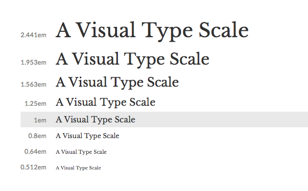
Scaling is equally important. You might have finalized your typography using 100% scaling; however, viewers could view it by either zooming in or out. So, the typography should be able to scale well when it is zoomed in or out. Graphic designers need to consider the type of zoom and how the text looks when someone views it within the same layout.
Alignment
We all use word documents quite often and so we are familiar with alignment. We know that there are four types of alignment – left, center, right and justified. The same is true for typography in web designing. To make the typography readable, it is appropriate to opt for justified alignment. Justified text looks great in print media; however, in the web version, it may not look that good. So, in the web version, it’s better to use the alignment in which all the lines are proportionally arranged.
Get Creative
Typography can infuse style and personality into your text. It has the potential to connect with the viewers. We would love to hear from you on what matters the most to you when you use typography in a creative way.
If you need any help with your brand, then do write to us with all your queries at info@medialabs.in. You can Check out our social pages – Twitter, LinkedIn and Google+ to get more updates.
Hey, thanks for the info. Now what?
If you need any help with content creation, we have tons of free resources to get you over the hump. Please subscribe to this blog to ensure that you never miss an article.
Have questions or comments? Please use the comment form down below. We read and reply to every comment.
If you really enjoyed this post, please help us to spread the word by clicking one of the social media sharing buttons.
Thanks so much!


